Lofi Café
A conceptual café brand exploring Swiss typography, rebus design, and AI-assisted web experiences.
Live Screenshots
Visit live site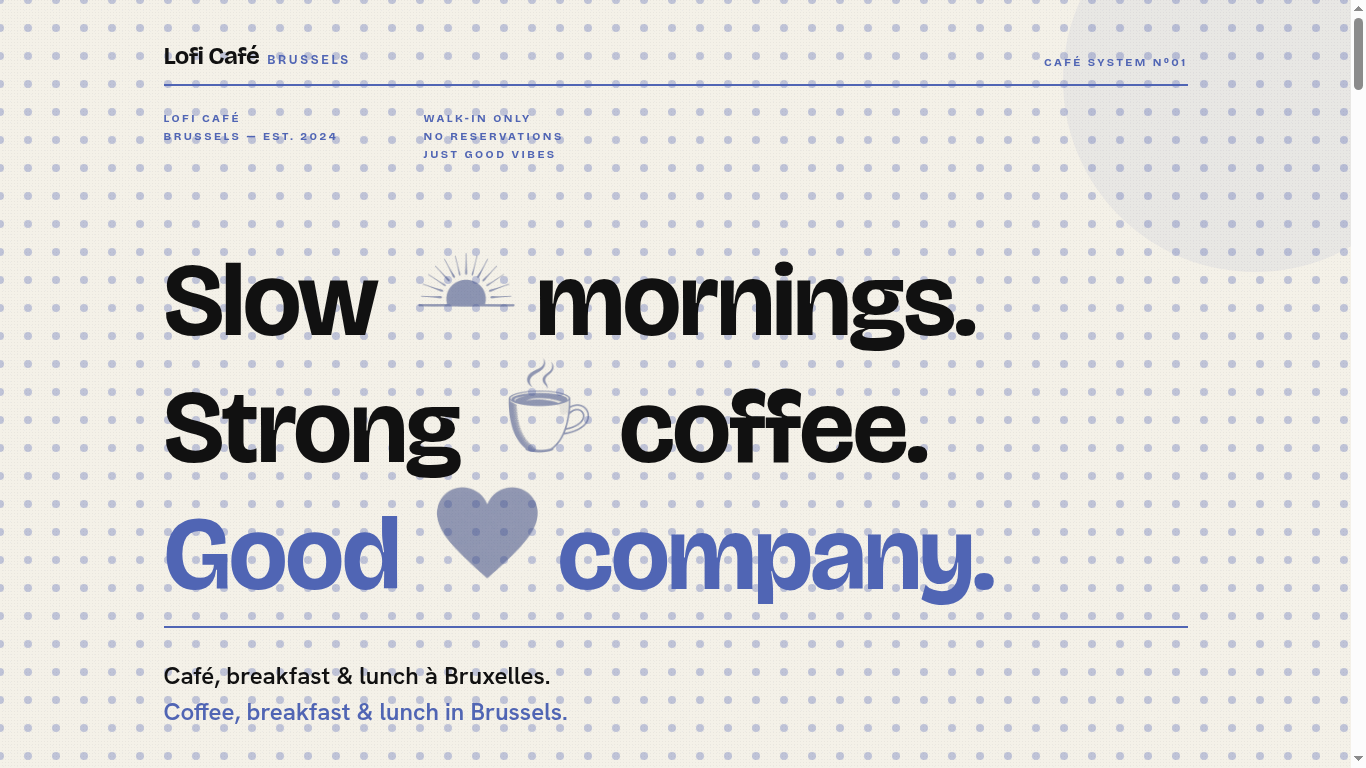
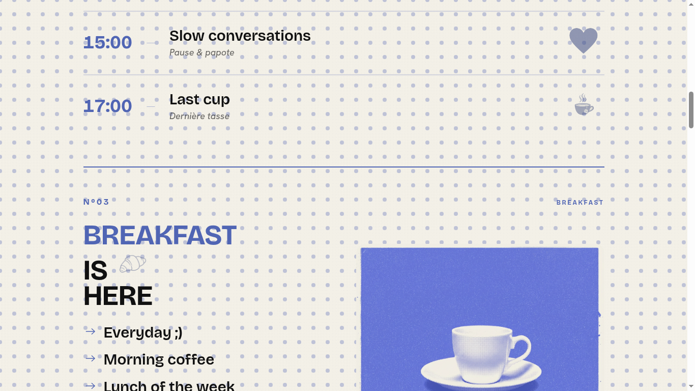
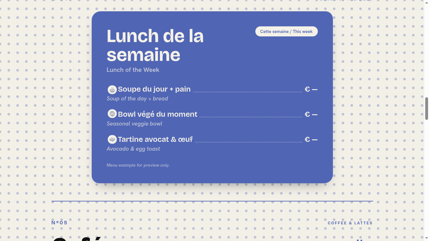
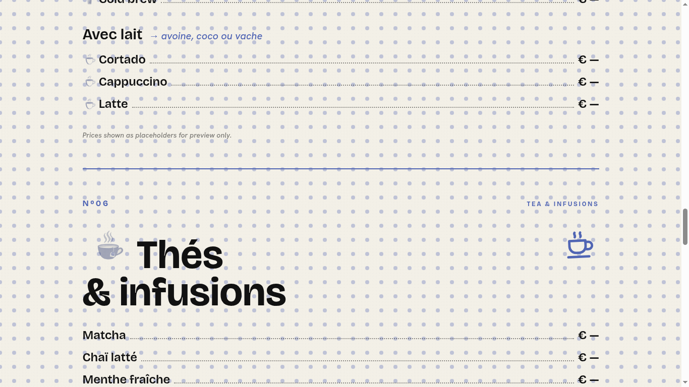
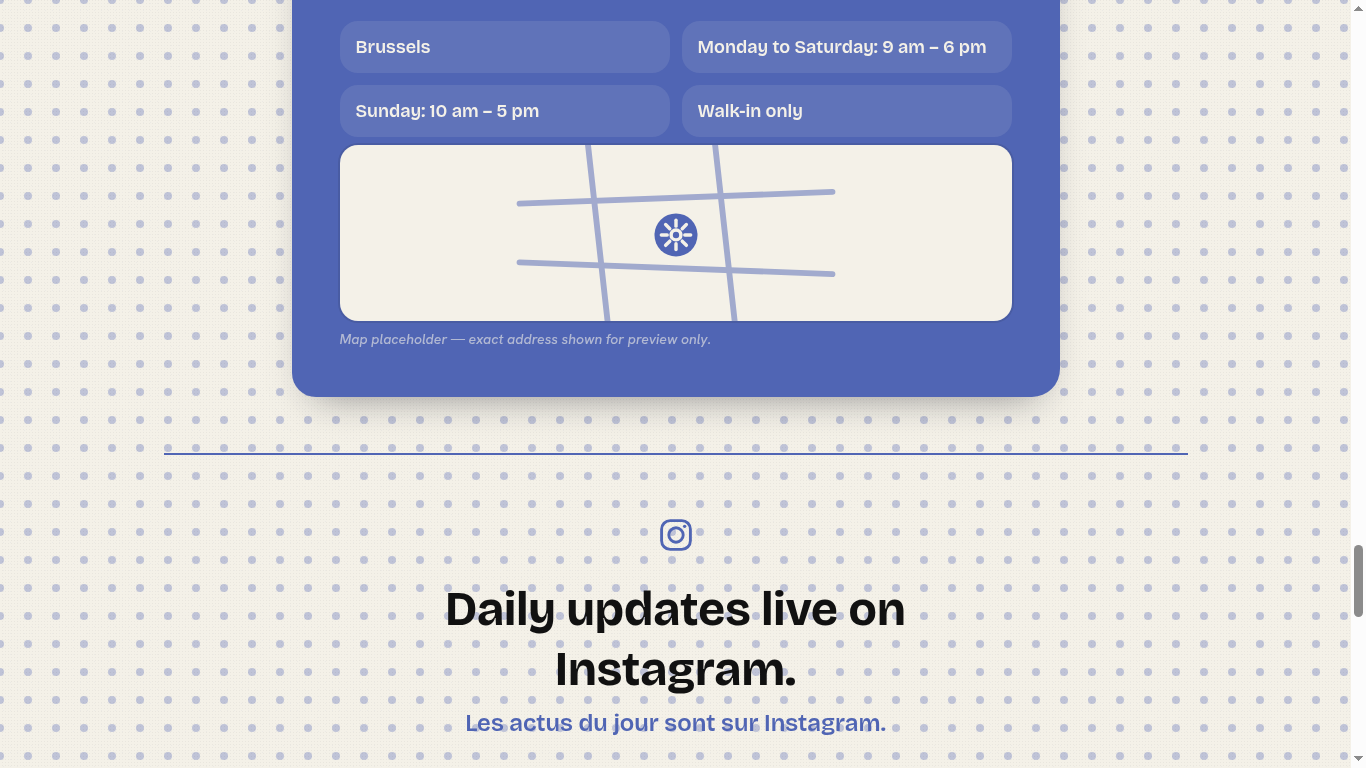
Captured from the live deployment.
Project Snapshot
- Client
- Internal / Concept
- Client Type
- Concept Exploration
- Role
- Brand + Web + Creative Direction
- Timeline
- Concept sprint
- Tech Stack
- React · Tailwind · TanStack Start
- Live URL
- lofi-cafe.lovable.app
The Challenge
The brief: explore whether a café brand can be carried entirely by Swiss typography and rebus iconography — without leaning on the usual café visual clichés (latte art photography, hand-lettered chalkboards, warm wood textures). Could form, type, and rhythm do the heavy lifting a mood photo usually does?
The Direction
Typographic-first, restrained, distinctive. A Swiss-inflected design system where the wordmark, type scale, and grid carry the brand's emotional weight. Rebus design as a recurring motif — letterforms and symbols substituted for words, rewarding sustained attention. AI used as a production accelerator (layout iteration, copy variants, asset generation), not as a stylistic crutch.
What Was Built
- Brand direction and typographic system
- Wordmark and rebus symbol set
- Web design (homepage, menu, story, contact)
- Responsive frontend build (React · Tailwind)
- Design system with semantic tokens and type scale
- Motion accents and micro-interactions
- Deployed live on Lovable for review
- AI-assisted production workflow throughout
What this demonstrates
A coherent visual system that proves a café brand can lean entirely on typography, rhythm, and rebus motifs — without a single stock latte. A reference point for how Swiss formalism and AI-assisted production can produce work that feels considered, not generated.
Related Services
Need something similar?
Fixed scope. Fixed price. Senior engineering from intake to handover.